The most entertaining, and perhaps most acute, business book that I’ve read in several years is “The Management Myth: Why the ‘Experts’ Keep Getting It Wrong” by Matthew Stewart (you can read a short book review by Andrew O’Connell at HBR online). Matthew is a cynical ex-consultant who reports on the methods consultants use to win business, debunks management theory, and provides a strong cautionary tale for anyone contemplating a consulting career.
According to Matthew, consultants often swoop in, use a company’s own data collected from various systems, massage that data (which can involve more assumptions than a consultant would like to admit to) and present the results in an eye-popping chart. Among the most powerful charts at the disposal of consultants is one his organization used to call “the Whale” or “the Leviathan.”
Once in the domain of consulting houses, these diagrams are today part of the analytics offered by ERP and best-of-breed software vendors. The chart below is an example of a typical whale diagram offered by Acorn Systems, a supplier of activity based costing solutions.

What this chart shows is that 20 percent of a particular company’s SKUs generate 180 percent of that firm’s profits, most products generate neither profits or losses, but 20 percent of SKUs lose most of the profit generated by the best products. A similar analysis can be done for customers—i.e., a small percentage of customers are highly profitable, while a roughly equal percentage of customers are highly unprofitable. Logistics can play a role in making some customers particularly unprofitable. Customers that require special handling (nonstandard pallets, for example), engage in rush orders, cancel or change orders frequently, require value-added services (perhaps RFID tagging) are usually highly-unprofitable customers.
My list of the most powerful business charts also includes:
- The “price waterfall” which shows how customer profitability is diminished by the wide variety of price discounts offered to customers by sales;
- The “cost locks” (the inverse of the price waterfall; imagine someone going upstream in a boat and being lifted by locks to higher levels of a river) which shows how various customer extras add to the cost of doing business and diminish profitability;
- And various “complexity reduction” charts. One example shows the number of SKUs in a product family, and how certain products in that family add cost in the form of complexity, while adding little in revenue. This chart looks like an upside down tree with metrics at the bottom to measure the worth of individual SKUs.
The price waterfall and cost locks are often combined into one chart. They are complementary to the Leviathan because they help to show why a company’s products or customers are profitable or unprofitable based on the activities performed on behalf of that company and the discounts offered.
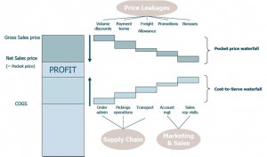
All three of these charts will be more accurate if built using activity based costing (ABC). In fact, I would argue these charts are not sufficiently accurate unless they are based on ABC. Other companies offering activity based costing solutions include Oracle and SAP (both ARC clients), SAS, and S&V Management. Similar to ABC, but better at modeling manufacturing costs in a granular way, is throughput costing. pVelocity and Maxager specialize in this form of costing.
In the book, Mr. Stewart has his sales manager showing the Leviathan chart, based on some preliminary work the firm did, to a potential customer, Joe. “’Joe peed his pants!’ the [sales manager] would say exultantly. Faced with such a devastating analysis of his core business – what on earth were his people thinking, doing all that work on behalf of unprofitable customers?! – Joe had no choice but to hire us to sort out the mess.” The whale chart allowed them to harpoon the customer. And a big customer could be a leviathan in terms of the revenues they would generate over several years.
If a picture is worth a thousand words, then the most powerful business charts are worth a million dollars.


